You should customize things!
It's no secret that I'm a huge advocate of customizing my user interfaces in various programs!
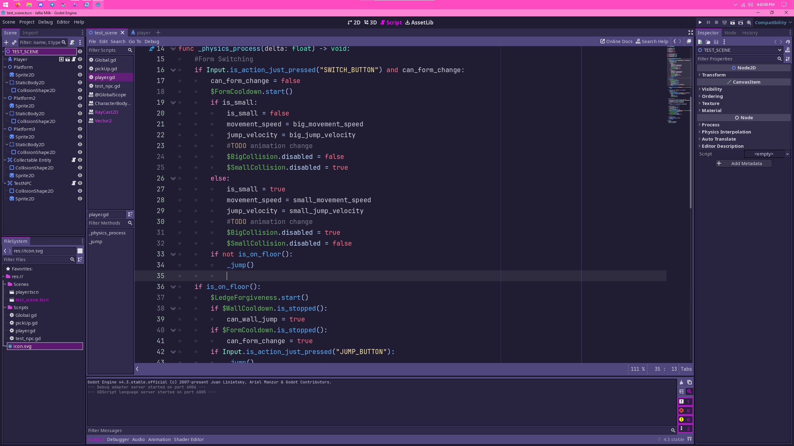
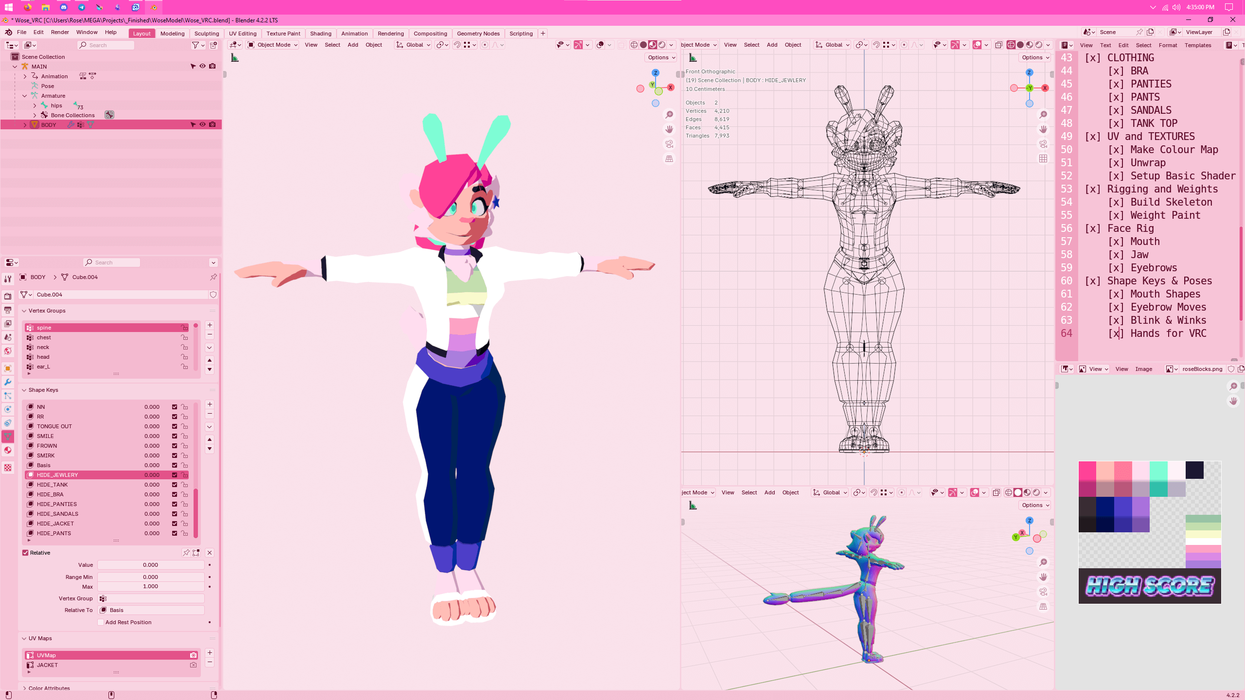
There are many times where I'm working on stream and people will ask me "What software are you using?" simply because my UX mods have made programs like Blender and Godot unrecognizable to those who don't use them regularly!
But why do I customize things?
Firstly, I don't see too good
I have pretty bad astigmatism that makes bright thin points of light very streaky and hard to see. There are a lot of ways to mitigate this issue and the majority of them require making sure things are well and evenly lit. As such I'm already always in a well lit and bright room when I'm working typically. An issue arises with typical user interfaces though!
Over the last decade of UX design, dark modes and themes have been on the rise. Most new websites and software being developed in recent years not only ship a dark mode, but often are in dark mode by default! Now this isn't an issue in itself typically. There are many alleged advantages to dark mode, such as reduced eye fatigue, better monitor health and making it easier to sleep at night. But a lot of these benefits may just be perceptual or greatly exaugurated.
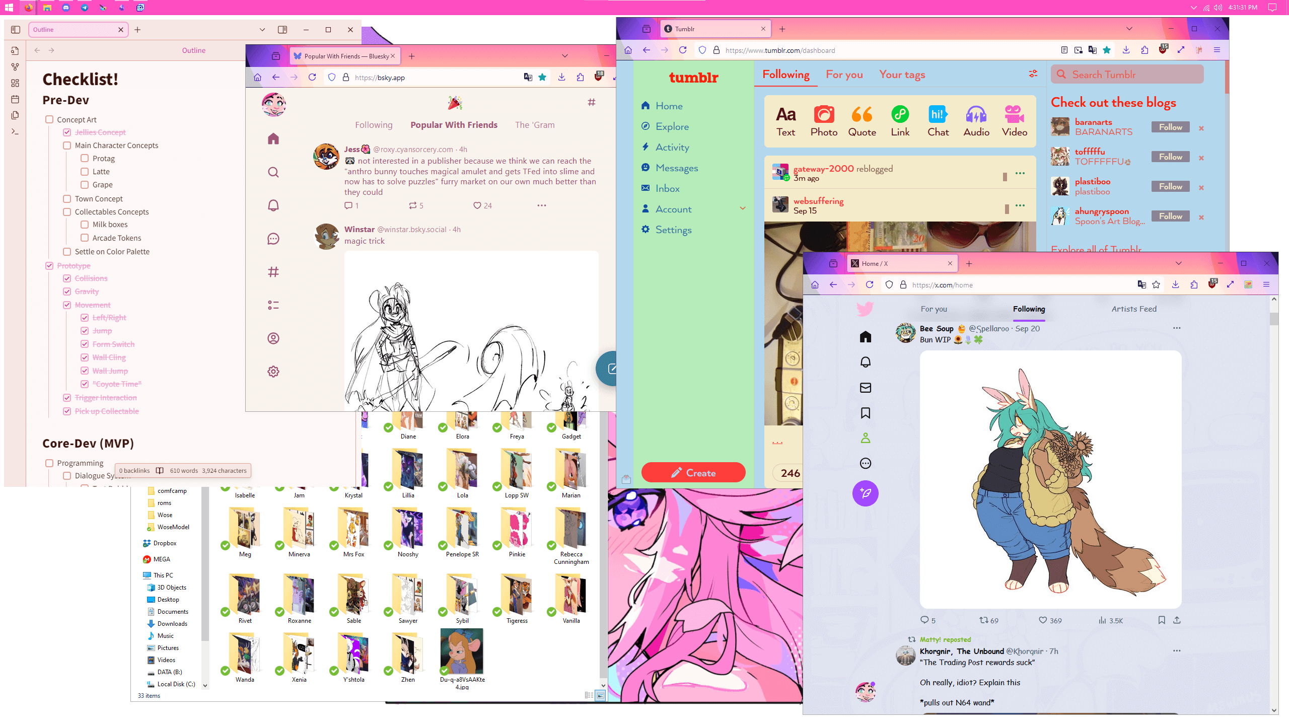
I'm not going to weigh in the debate of what's better or worse in general, but I can say that for me, light mode is much better! When I'm using dark mode I find that the text suddenly fulfills the conditions for my astigmatism, being small thin points of light on a dark background and I end up having to squint just to read. Again this is usually not a huge issue as I can just switch whatever app I'm using to a light mode theme and not have any problems. The thing is though... a lot of modern platforms only have a dark mode and this makes them much harder to engage with for me. Which is why I typically will try to apply a custom theme whenever I can to make things easier.
Unfortunately not every programs ability to be customized is good enough for true light mode usage, but in these instances I will still try to create a lighter and lower contrast dark theme, like I had to for Godot.
Secondly, It's just fun!
Computers can and should be fun. There was a push from the mid 90s to now to "unify" towards minimalist corpo safe design and it's made computing in general very clinical. One of the best ways to take this back is to just replace their sanitized UX styling with your own!
Having vivid colours, silly fonts and bold icons can completely change how you vibe with the software or site you're using. People spend 100s of dollars on customizing their tools of the trade to better suit them, so it's wild to me that so few users customize their software the same way!
How you can do it to!
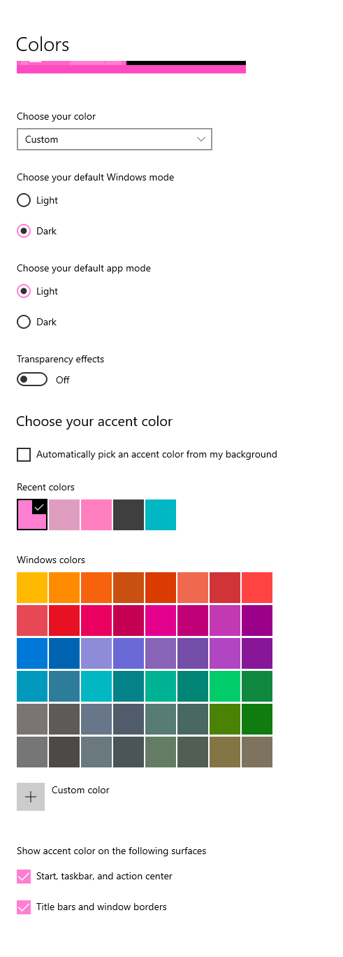
It's easy in most open-source software to just go into their settings and change the theming and a shockingly large number of commercial programs support the same! Hec, It's even easy to make modern windows bold and colourful with just a few tweaks in the colour menu and setting a custom mouse cursor! (I use bibwata modern ice)
For websites, it's very easy to setup what are called "user styles". Just install the browser extension Stylus, which is available for most web browsers and then navigate to your favourite websites. Click on the plug-in and click "find styles". Most sites have a fair few available, with many further customizable to your own preferences!
Now not everything in the world is going to be theme-able and that's okay. But for every program that lets me make it pastel pink, I'm going to do so!


